
Widget-First Builds
How BuildPress composes pages from reusable, token-bound widgets instead of loose markup.
By default, BuildPress builds your page out of named, reusable, design-system-bound widgets: a hero, a feature grid, a CTA band, a header, a footer. It does not drop loose generic page-builder elements onto a canvas. Each region of the page is a real building block that knows your tokens, so one design change re-themes everything.
Reuse or create
For each region of a page (each section, plus the header and footer) your AI makes one of two choices. It either reuses a widget already in your library that genuinely matches the request, or it creates a new widget from BuildPress's own section and component blueprints. Either way the result is token-bound: every color, type, and spacing value points at a kit global, never a raw hardcoded hex or px. See the design system for how those tokens are stored.
An empty widget library on a fresh project is the normal state. It does not mean BuildPress will fall back to native elements. It means create the widgets now. As you build, the library fills up, and later builds start reusing what is already there.
What token-bound means in practice
A widget never carries a fixed color or font size baked into its markup. It references your kit globals. When you later change a token, every widget that uses it updates at once, with no per-page rework.
Pages are always composed
A built page is a standard WordPress page. It is composed of section widget instances stacked top to bottom, with header and footer widget instances wrapping them. There is no monolithic page widget type. One section equals one coherent region, and the page is just those regions in order.
- Each section is one coherent region: a hero, a feature row, a testimonials strip, a CTA band.
- Headers and footers are their own reusable widgets. They are never inlined into a single page, so updating one updates them everywhere they are used.
- The page itself is plain WordPress content, readable and editable like any other page.
Which builders it works on
Widget-first building runs on your base builder, which you pick during setup. Two are supported today.
- The BuildPress Builder (the default): every widget is a native WordPress block, rendered through WordPress's own block system. Any standard theme displays your widgets correctly, with nothing extra to install and no theme-file edits.
- Elementor: the same widget-first approach, building with Elementor's own widgets, available whenever Elementor is installed and active.
You choose your base builder once and can switch later without losing anything. See the builder overview for the differences and how to change it.
The widget library
Your library holds four widget types, all unlimited: components (one atom, like a button, card, badge, or stat), sections (one coherent region), headers, and footers. One purpose per widget is enforced, so widgets stay small and recombinable.
Widgets live on your own site under wp-content/buildpress, organized per builder, so switching base builders never deletes anything. You manage them at BuildPress -> Widgets, a tabbed admin page (All, Components, Sections, Headers, Footers). There is no cap meter, because there is no cap.
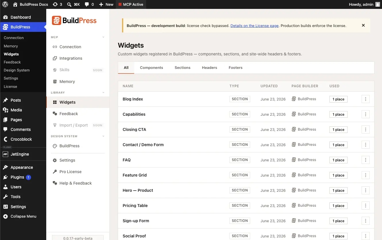
Render composition lets a section widget embed reusable component widgets inside its own render, keeping the component to section to page to pattern reuse chain intact. This is free on every base builder. A token edit re-themes everything, and improving a widget updates every instance of it.
When a composition is worth keeping, you can save it as a reusable pattern (a whole page or a slice) and apply it elsewhere. Applied output stays live: it lands as widget instances bound to your central design system, not frozen markup, so token edits re-theme applied patterns too. Your pattern library grows from your own builds.
Prefer raw Elementor?
Builder-native building is an explicit opt-out. There is no toggle to hunt for. Just tell your AI in plain English, for example:
Build it with raw Elementor, no BuildPress widgets.Your AI then free-assembles native widgets with no library reuse and no blueprints. If you want it to stick, ask for a permanent preference and it is saved to your Project Memory:
From now on, always build with raw Elementor, no BuildPress widgets.Even in builder-native mode, the universal rules still apply. Colors and typography still bind to your kit globals, never hardcoded. Your AI still avoids inline CSS or style tags and does not use the HTML widget for content (third-party embeds aside). For the difference between the BuildPress Builder and Elementor as your base builder, see the builder overview.
Heads up
Your AI announces the widget-first default once per session and notes that raw Elementor is available on request. You never have to phrase the opt-out a particular way: it reads the intent from your wording.